Sometimes, I really don’t understand some public relations types. I often receive random emails from them out of nowhere wanting me to share their ‘best infographics for travel‘ on my social media channels for free publicity – all for nothing in return (not even a sponsored post)! Hey, I’m a travel blogger for hire.. and a SEO / content specialist too!
Usually, I haven’t heard from these people before, and I probably won’t ever again! There’s been a couple of times where I have been featured in a travel infographic, and that’s great, because I’m being included, but a lot of the time, these emails go straight to the ‘delete’ button!
They can sometimes be pretty annoying. Considering that they’re probably getting paid heaps by large multinational travel companies to get their message out there.
Over the past couple of years, I’ve noticed a sharp increase in unsolicitied emails from public relations people almost practically begging me to share their infographic on this website and on my social media channels, and even create travel articles from it.
Usually, the email goes along the lines of this:
‘Hi [inset travel blogger name here – hopefully the right one! Yes they sometimes get this wrong!]
I hope you’ve had a great week so far! I was recently reading through [insert your travel blog here – once again, hopefully the right one] and I really liked your content – it makes me want to go on a holiday soon. Since your content is mainly focused around travelling I thought you might be interested in an interesting piece that I’ve been working on with [insert large multinational travel related company here].
The piece is a handy infographic that focuses on [insert relevant subject matter here]. It’d be great if you could check it out and consider sharing it with your readers. You can find it here!
Please let me know what you think, I look forward to hearing your thoughts either way.’
The first thing I think when I receive and email like this is ‘so what?’ Why are you sending me this stuff that isn’t relevant to what I do?
These ‘data visualisation’ concepts don’t seem like dying any time soon, so if you can’t beat them, join them!
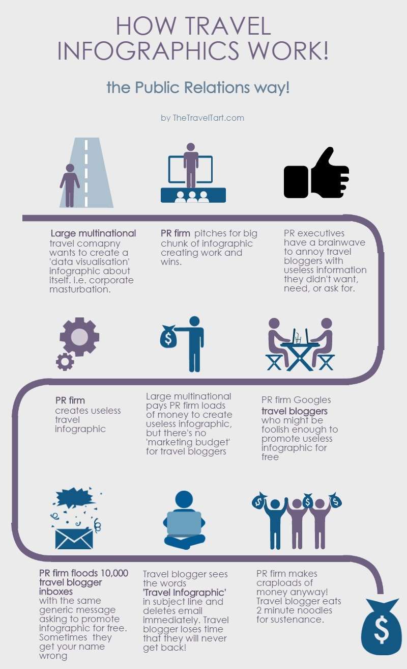
I’ve decided to make fun of this data visualisation trend by creating my own useless and stupid travel infographic!
Best Infographics for Travel – How They Really Work!
I was quite amazed how easy it was to come up with one of these. I can see why public relations people produce these – it requires minimal effort and there is the potential to flood the internet with more junk in a cost effective way!
This shonky piece of work took me about 5 minutes from beginning to end! And it looks almost half decent! You can also create your own using websites like Piktochart, which I used here!
Here is my effort – how travel infographics work!

There you go!
I’m thinking of spamming PR types with this useless infographic when they send me one just so they know how I feel!
By the way, feel free to share this travel infographic with all of your Facebook friends and Twitter followers! ;P
Yes, I can see the irony in that…
Why hasn’t this been done before?! It’s so true, and I now actually work for one of those wanker PR firms as I have so much experience of been on the back end of it! Good times!
Ha ha, thanks for the shout out! I aim to be close to the truth!
Hahaha! This is amazing. You may or may not also be pleased to know you’re in the top search results for “travel infographic” in Google images. ??
Thanks Alex!